LiveWork Denver
Web Design & Frontend Development
Live Work Denver exists to empower people to live in communities that matter to them. Their work spans expertise in real estate, finance, zoning, co-living, co-ops, and all manner of lifestyles (and livings) off the beaten path.
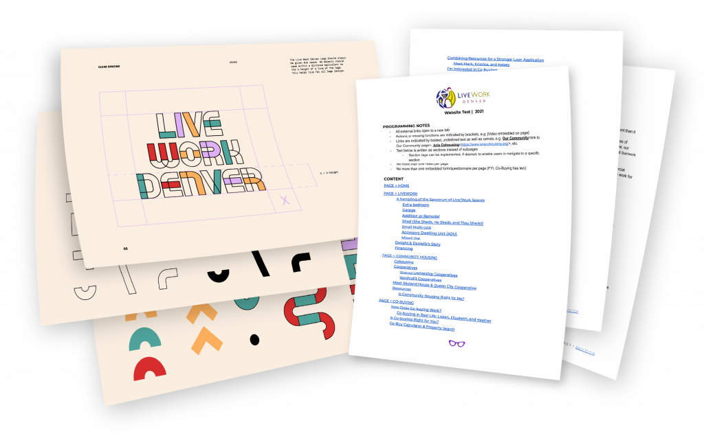
I designed their website to celebrate the launch of their new brand. Utilizing a professionally developed brand guide and a comprehensive web copy document, I translated their story into their new visual language.
Background
I’ve followed Sarah Wells of LiveWork Denver since learning about her through her activism and ownership of Queen City Cooperative. As a fellow co-home owner, I was instantly inspired by her work. We actually hired her as our real estate agent when it came time to sell our home.
When I saw Sarah reaching out to her community in search of a web designer for her company’s new brand, I jumped on the opportunity to offer my services.
This project was such a treat – a powerful mission, an inspiring team, and a very prepared client. This was the first time I’ve been presented with a full brand guide and complete copy for the whole site. To put it simply – they’d “done the work.” My task was to design the site and hand it off to their developer, Dwight of My Denver Web Design.
Discovery
Together, we discussed the following guidelines, I jotted down my understanding and we collaborated in Google Docs on refining the vision.
Audience:
Artists, Activists, Entrepreneurs. People who tend to see the world outside of the status quo, innovators Interested in ownership but afraid.
Intent:
Provide hope and inspiration that home ownership is possible for the viewer, and that contacting LiveWork is the first step.
Calls to Action
1. Contact LiveWork (Contact Form, Phone Number) 2. Stay connected / newsletter.
The Feel:
Welcoming, inspirational, & hopeful. Unconventional. Authentic. Inclusive.
Challenges
- Colorful, inviting, artistic, abstract, community-vibe branding – yet still need to communicate a clear focus on Real Estate.
- Need to consider the importance of photos in complementing and continuing the story being told in the branding. Consider what we want to communicate through the photos (this is Real Estate, and also about what happens in these homes. Communicate possibility & diversity)
- Design needs to accommodate a lack of consistent professional photos – rather a wide variety of quality and style of snapshots from community events, client photos, etc – as well as a need to source niche stock photography.
Design
- Using the icons from the brand guide and animating them
- Animations putting the brand pieces together
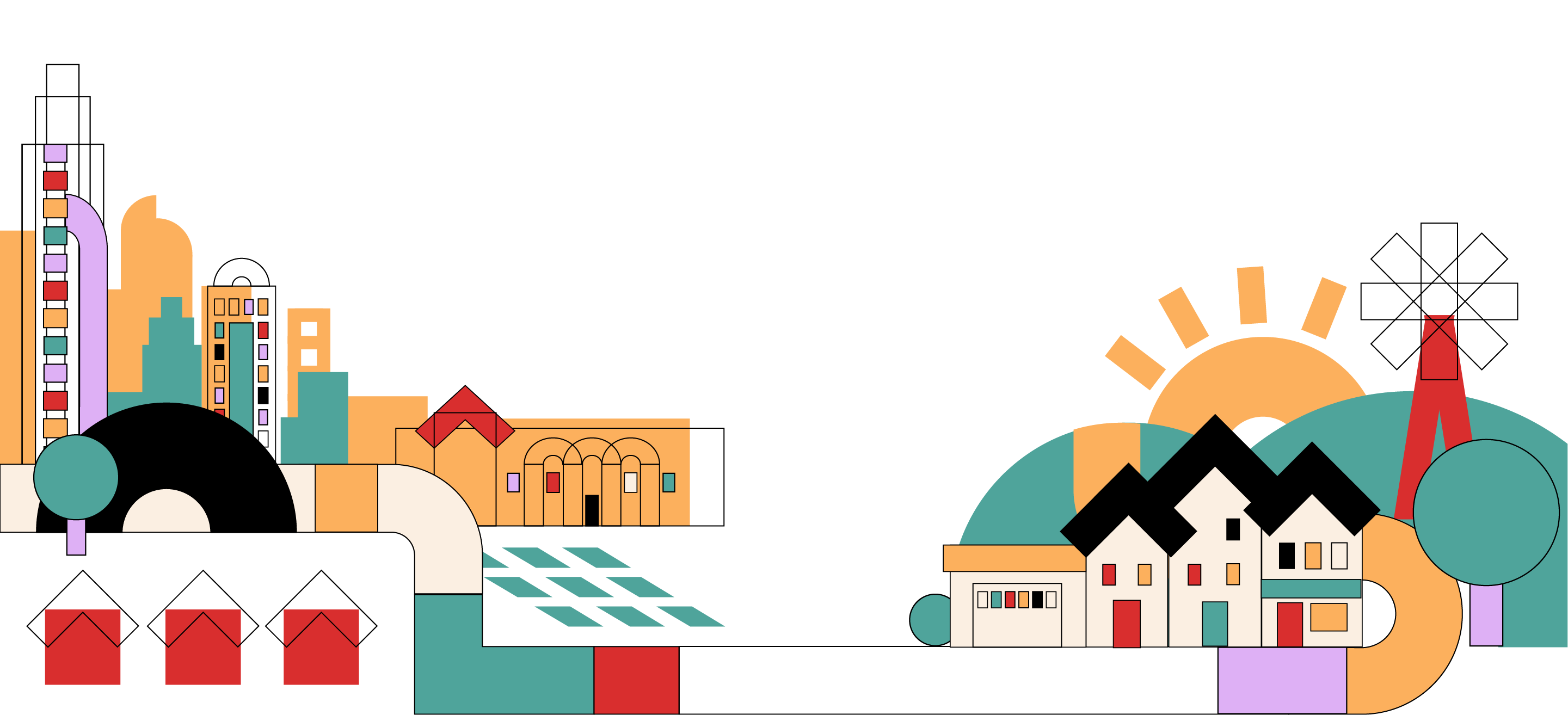
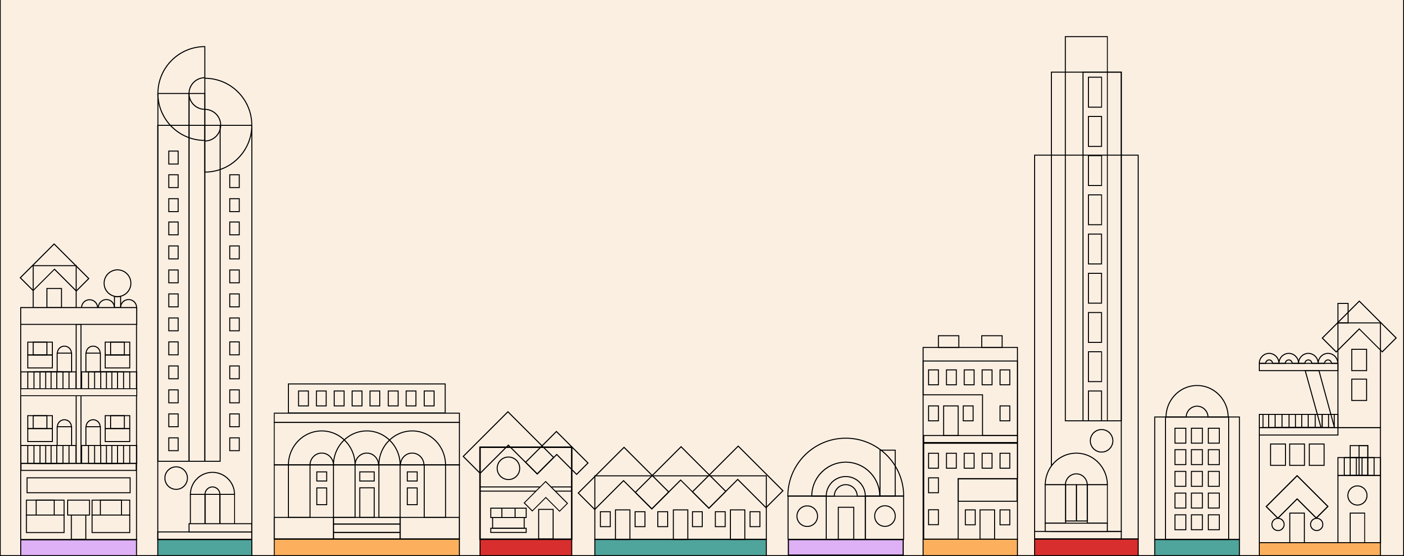
- Using the brand icons to create architectural/cityscape designs
- Potentially creating illustrations with similar linear/fill style to the brand pieces
- Long-form homepage, more scrolling is better in general.
The Sketch
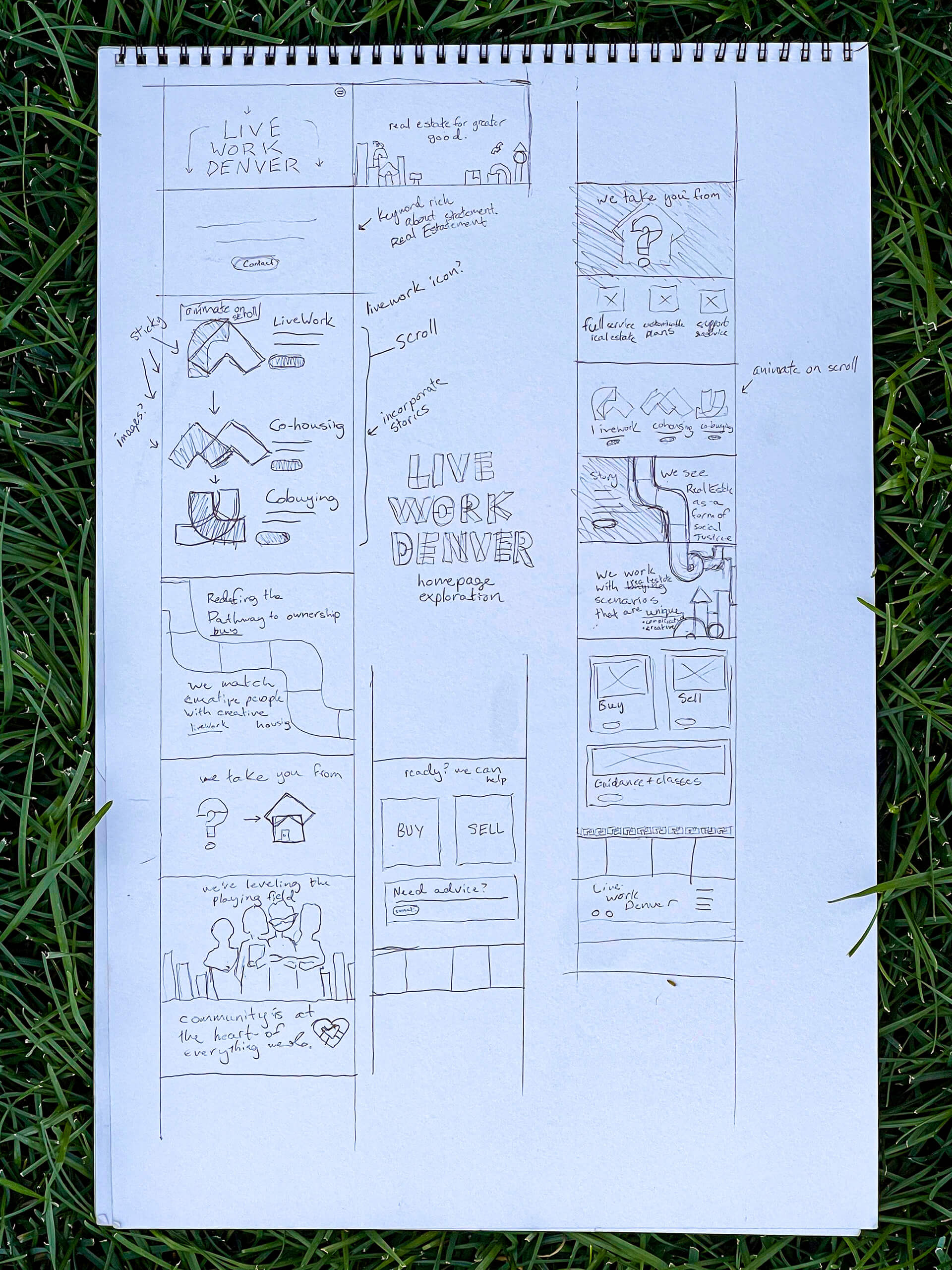
When Sarah informed me she sometimes struggled with the ‘grey box’ placeholders commonly used in wireframes, I decided to go back to my roots and use sketches and skip the wireframes entirely. I felt this may make it easier for her to focus on the structure and organization rather than the visual presentation.
Many of my sketches for this project were actually done via a physical whiteboard which I modified in real time during early design discussion. We don’t have photos or recordings of those sessions.
I did however make some rough sketches for the home page. This page was unique in that, while we had a sitemap and copy of all secondary pages, there was no copy supplied for the home page. It became my task to thoroughly understand their story and suggest a summary of it to be displayed as their home page.
We discussed via Zoom a number of possibilities and they conveyed certain phrases that were most important for us to include.
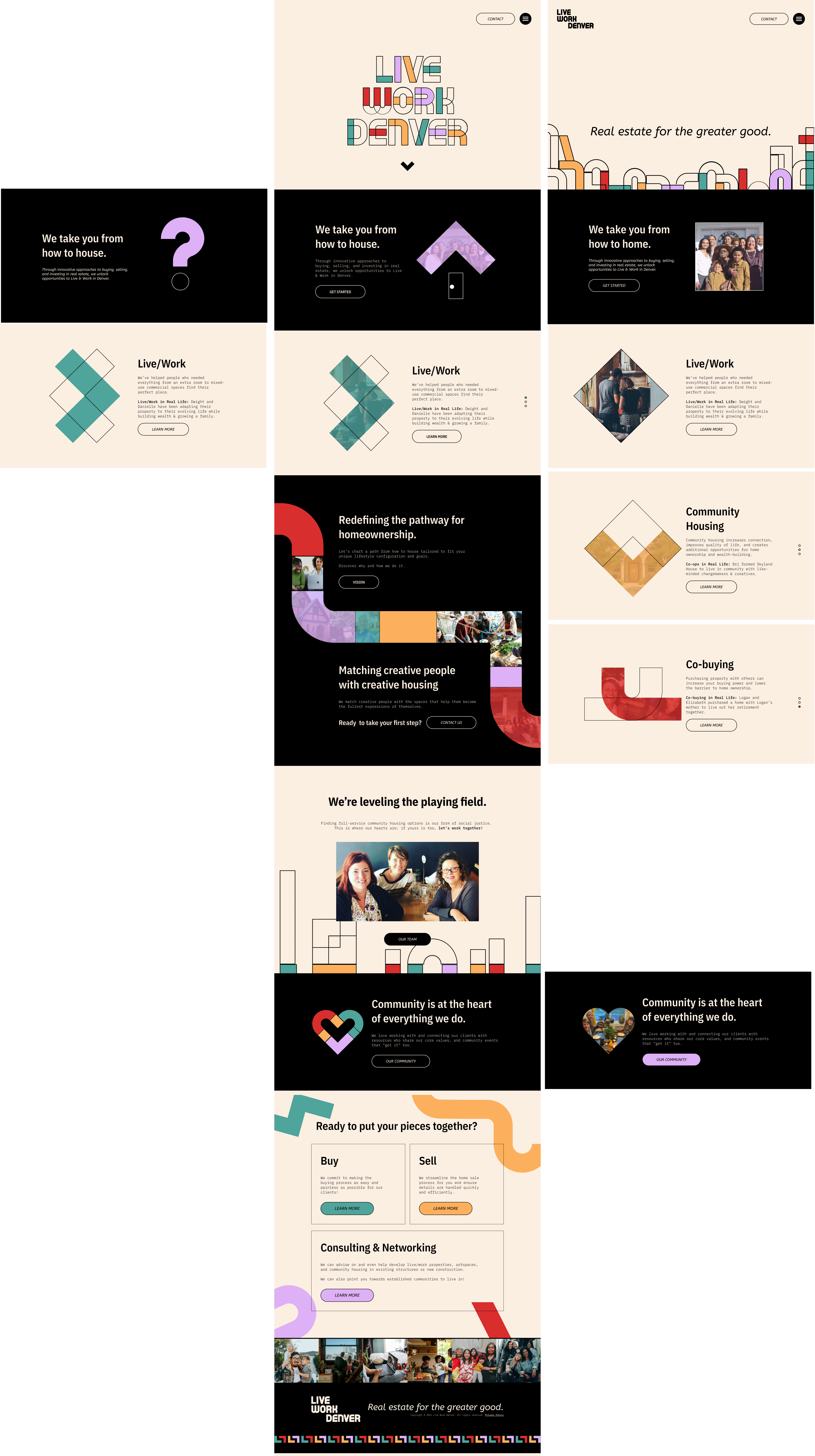
After I felt I had a good understanding, I moved to fully rendered mockups in Figma.
Mockups
The decision to move directly to fully rendered mocks was based on a desire to begin exploring the brand guidelines as well as the team’s preference for more realistic photos. Why stop there?
I was mindful when designing to incorporate smaller images – you won’t find any full-width photos at all. We used a lot of photos from social media and stock photography, so without high-quality brand photography, I embraced our ‘limitation’ as a representation of the hodge-podge quilt of community.
Instead, I highlighted the use of the brand icons as the cornerstone of the design using animations, image masks, and illustrations. This became our visual drama rather than photography.
Icons & Illustrations
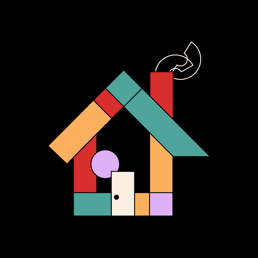
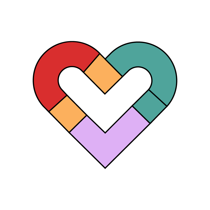
Play was built into the design for this brand. By using ‘pieces’ to form the logo and icons, the brand designer opened opportunities for me to reimagine these pieces as anything we needed to depict on the page.
I enjoyed the lego-like experience of building illustrations which enhanced the story of Live Work Denver’s ability to bring together such a wide range of knowledge, resources, and services, to tailer housing solutions for all their unique clients.







Animations
Another exciting aspect of this project was the team’s interest in creating interactivity and action through the use of animation.
I’d long had my eye on Lottie technology and found Lottie widget for Divii, so it felt like the right time to expand my creative arsenal.
The lottie widget I anticipated using wasn’t rendering properly, so I ultimately learned how to code the JS directly which ended up being a more time-consuming, though rewarding experience.
Though the client is happy with the site, I’d like to implement a few additional animations in the near future.
Results
Development
Hand-off to our developer Dwight went smoothly with a little guidance into to Figma. He built out pages efficiently and we were able to collaborate on a few trickier components. I implemented the lottie animations and made final frontend development touches.
Launch
We launched in alignment with LiveWork Denver's spectacular brand launch extravaganza. It was an honor to play a role in their full-circle achievement defining, expanding, and celebrating the good work they do in the Denver community.
Response
The LiveWork team seemed pleased with the launch and expressed gratitude for my commitment to the vision. Their clients also gave positive feedback. LiveWork Denver continues to receive new quality contacts from the web forms we installed.
Reflection
Positives
- Beginning with Brand & Copy – Working with a an externally developed brand guide is a rare thing. It’s a fun challenge to speak another designer’s language. This particular design was creative, flexible and playful. I enjoyed the freedom to create custom icons, illustrations & animations through the various pieces and parts.
- Authentic & Creative Clients – Working with the LiveWork Denver team (in particular, Sarah, Laura, and Bri) was an empowering experience. The team is authentic, genuine, clear, communicative, and truly celebrates creativity. They often work with artists and other creatives as clients and after working with them, it’s evident why they’re so successful.
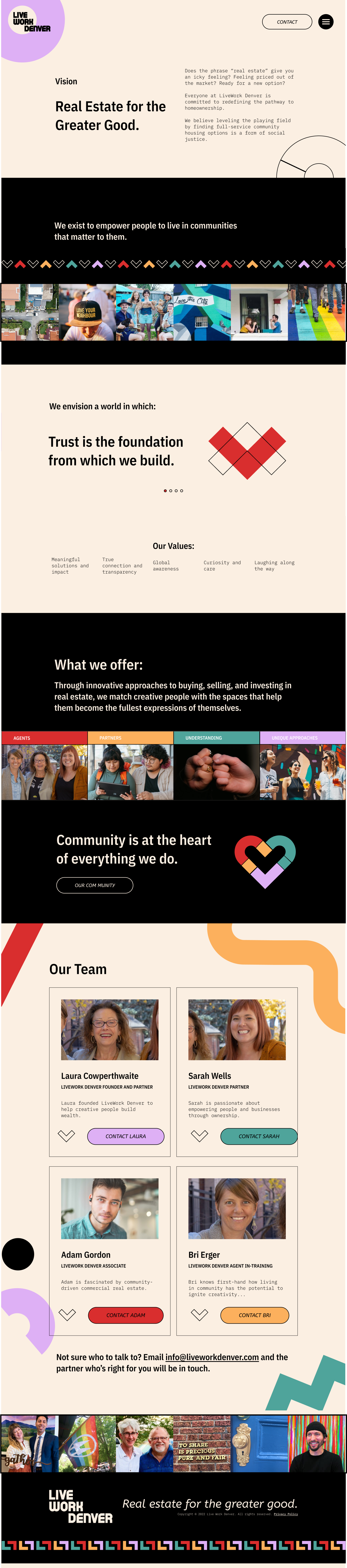
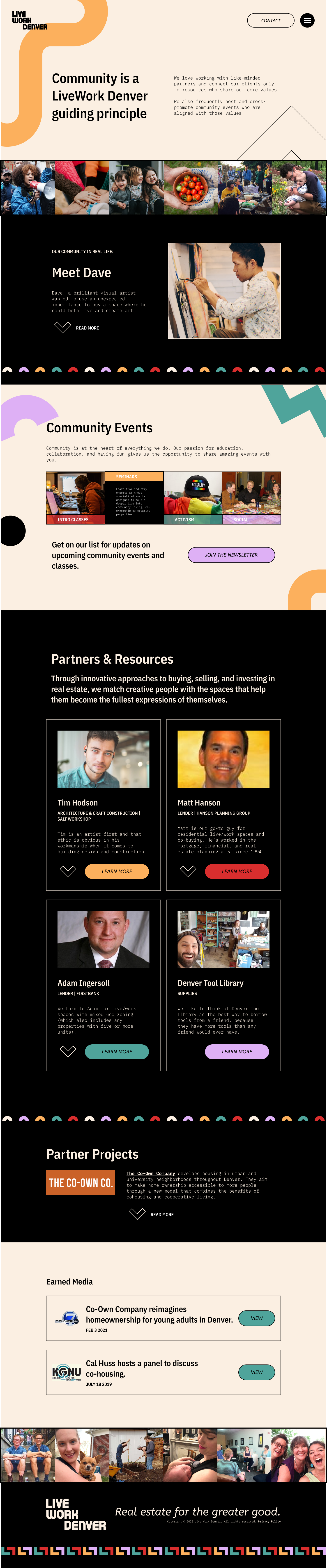
- Secondary Stories – Instead of thinking as each secondary page as a templated copy-container, working with the full copy allowed me to design in a way that visually told their story on each page.
Possibilities
- Test Driving Technology – My After Effects and Lottie experience through Elementor led me to under estimate the complexity of implementing our animations through Divi. Ultimately I hand-coded the animations which took more time. In the future, I will ensure I learn and test new skills before quoting their completion.
- Process Synchronization – In the future I see myself calling for more collaboration with Developers throughout design process. While we discussed sample sites and got the green light on mockups, there were still many design features (including animations) that took a creative touch using the Divi editor.
- Onward & Upward – I’d like to refine the icon animation and replace the current slideshow with a scroll-animated Lottie, sticky within a left column, and a right column with 3 full-vh slides. Navigated through scroll or dot navigation sticky to the right of the slides.